In this article we will look at some of the swing controls available in javax.swing package along with sample Java code for each control.
This article is a part of our core java tutorial for beginners.
Contents
Labels
The JLabel class is used to display a label i.e., static text. A JLabel object can be created using any one of the following constructors:
JLabel(Icon icon)
JLabel(String str)
JLabel(String str, Icon icon, int align)
In the above constructors icon is used to specify an image to be displayed as a label. Icon is a predefined interface which is implemented by the ImageIcon class. str is used to specify the text to be displayed in the label and align is used to specify the alignment of the text.
Some of the methods available in JLabel class are as follows:
void setText(String str) – To set the text of the label
String getText() – To get the text of the label
void setIcon(Icon icon) – To display an image in the label
Icon getIcon() – To retrieve the image displayed in the label
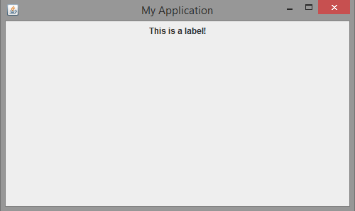
Following code demonstrates working with a JLabel:
import java.awt.*;
import javax.swing.*;

public class MyFrame extends JFrame
{
	JLabel l;
	MyFrame()
	{
		setSize(500, 300);
		setTitle("My Application");
		setLayout(new FlowLayout());
		l = new JLabel("This is a label!");
		add(l);
		setVisible(true);
		setDefaultCloseOperation(JFrame.EXIT_ON_CLOSE);
	}
	public static void main(String[] args)
	{
		MyFrame mf = new MyFrame();
	}
}
Output of the above code is as follows:
Buttons
The JButton class is used to display a push button. The JButton class implements the abstract class AbstractButton which provides the following methods:
void setDisableIcon(Icon di) – To set the icon to be displayed when button is disabled
void setPressedIcon(Icon pi) – To set the icon to be displayed when button is pressed
void setSelectedIcon(Icon si) – To set the icon to be displayed when button is selected
void setRolloverIcon(Icon ri) – To set the icon to be displayed when the button is rolled over
void setText(String str) – To set the text to be displayed on the button
String getText() – To retrieve the text displayed on the button
A JButton object can be created using any one of the following constructors:
JButton(Icon icon)
JButton(String str)
JButton(String str, Icon icon)
In the above constructors, icon specifies the image to be displayed as button and str specifies the text to be displayed on the button.
JButton objects raise ActionEvent when the button is clicked. It can be handled by implementing ActionListener interface and the event handling method is actionPerformed().
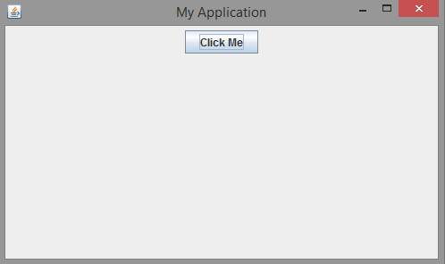
Following code demonstrates working with JButton:
import java.awt.*;
import javax.swing.*;

public class MyFrame extends JFrame
{
	JButton b;
	MyFrame()
	{
		setSize(500, 300);
		setTitle("My Application");
		setLayout(new FlowLayout());
		b = new JButton("Click Me");
		add(b);
		setVisible(true);
		setDefaultCloseOperation(JFrame.EXIT_ON_CLOSE);
	}
	public static void main(String[] args)
	{
		MyFrame mf = new MyFrame();
	}
}
Output of the above code is as shown below:
Toggle Buttons
The JToggleButton class creates a toggle button. It is different from a push button in the sense, a toggle button toggles between two states. When a user clicks on a toggle button it remains in the pushed state and again when the button is clicked it reverts back to its normal state.
The JToggleButton class inherits the abstract class AbstractButton. A JToggleButton object can be created using the following constructor:
JToggleButton(String str)
In the above constructor str is the text to be displayed on the button. A toggle button can raise both ActionEvent and ItemEvent.
Following code demonstrates working with JToggleButton:
import java.awt.*;
import javax.swing.*;

public class MyFrame extends JFrame
{
	JToggleButton b;
	MyFrame()
	{
		setSize(500, 300);
		setTitle("My Application");
		setLayout(new FlowLayout());
		b = new JToggleButton("Click Me");
		add(b);
		setVisible(true);
		setDefaultCloseOperation(JFrame.EXIT_ON_CLOSE);
	}
	public static void main(String[] args)
	{
		MyFrame mf = new MyFrame();
	}
}
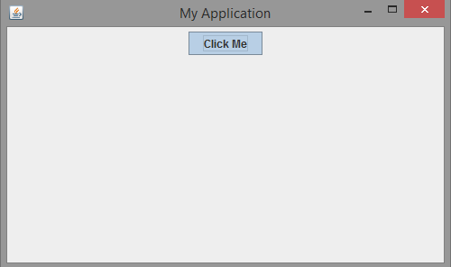
Output of the above code is as shown below:
Toggle button in the above output is clicked.
Check boxes
A check box can be created using the JCheckBox class which inherits the JToggleButton class. A JCheckBox object can be created using the following constructor:
JCheckBox(String str)
In the above constructor str specifies the string that is displayed by the side of box. A check box raises ItemEvent when the user selects or deselects it. This event can be handled by implementing the ItemListener interface and the event handling method is itemStateChanged(). We can use isSelected() method from JCheckBox class to know whether a check box is selected or not.
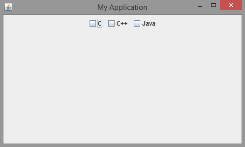
Following code demonstrates working with JCheckBox:
import java.awt.*;
import javax.swing.*;

public class MyFrame extends JFrame
{
	JCheckBox c1;
	JCheckBox c2;
	JCheckBox c3;
	MyFrame()
	{
		setSize(500, 300);
		setTitle("My Application");
		setLayout(new FlowLayout());
		c1 = new JCheckBox("C");
		c2 = new JCheckBox("C++");
		c3 = new JCheckBox("Java");
		add(c1);
		add(c2);
		add(c3);
		setVisible(true);
		setDefaultCloseOperation(JFrame.EXIT_ON_CLOSE);
	}
	public static void main(String[] args)
	{
		MyFrame mf = new MyFrame();
	}
}
Output of the above code is as shown below:
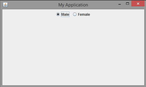
Radio Buttons
Radio buttons are used to create a group of mutually exclusive buttons. User can select only one button. The JRadioButton class can be used to create radio buttons. The JRadioButton class inherits the JToggleButton class. A JRadioButton object can be created by using the following constructor:
JRadioButton(String str)
In the above constructor str specifies the string to be displayed beside the circle. A radio button raises action event, item event etc. Most commonly handled event is ActionEvent.
We must also use another class ButtonGroup to group the radio buttons i.e to make them mutually exclusive. Following code demonstrates working with JRadioButton:
import java.awt.*;
import javax.swing.*;

public class MyFrame extends JFrame
{
	JRadioButton r1;
	JRadioButton r2;
	ButtonGroup bg;
	MyFrame()
	{
		setSize(500, 300);
		setTitle("My Application");
		setLayout(new FlowLayout());
		r1 = new JRadioButton("Male");
		r2 = new JRadioButton("Female");
		add(r1);
		add(r2);
		bg = new ButtonGroup();
		bg.add(r1);
		bg.add(r2);
		setVisible(true);
		setDefaultCloseOperation(JFrame.EXIT_ON_CLOSE);
	}
	public static void main(String[] args)
	{
		MyFrame mf = new MyFrame();
	}
}
Output of the above code is as shown below:
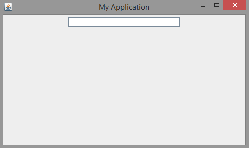
Text Fields
A text field is a GUI control which allows the user to enter a single line of text. A text field can be created using the class JTextField which inherits the class JTextComponent. A JTextField object can be created using any one of the following constructors:
JTextField(int cols)
JTextField(String str)
JTextField(String str, int cols)
In the above constructors cols specifies the size of the text field and str specifies the default string to be displayed in the text field.
A text field generates ActionEvent when the user hits the ‘enter’ key. It can also generate CaretEvent when the cursor position changes. CaretEvent is available in javax.swing.event package.
Following code demonstrates working with JTextField:
import java.awt.*;
import javax.swing.*;

public class MyFrame extends JFrame
{
	JTextField jtf;
	MyFrame()
	{
		setSize(500, 300);
		setTitle("My Application");
		setLayout(new FlowLayout());
		jtf = new JTextField(20);
		add(jtf);
		setVisible(true);
		setDefaultCloseOperation(JFrame.EXIT_ON_CLOSE);
	}
	public static void main(String[] args)
	{
		MyFrame mf = new MyFrame();
	}
}
Output of the above code is as shown below:
Tabbed Panes
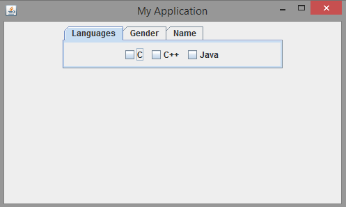
A tabbed pane is a control which can be used to manage several components in groups. Related components can be placed in a tab. Tabbed panes are frequently found in modern GUIs. A tabbed pane can be created using JTabbedPane class.
After creating a JTabbedPane object, we can add tabs by using the following method:
void addTab(String tabname, Component comp)
In the above syntax tabname is the name of the tab and comp is the reference to the component that should be added to the tab. Following code demonstrates working with JTabbedPane:
import java.awt.*;
import javax.swing.*;

public class MyFrame extends JFrame
{
	JCheckBox c1;
	JCheckBox c2;
	JCheckBox c3;
	JRadioButton r1;
	JRadioButton r2;
	ButtonGroup bg;
	JLabel l;
	JTextField jtf;
	JPanel langs;
	JPanel gender;
	JPanel name;
	JTabbedPane jtp;
	MyFrame()
	{
		setSize(500, 300);
		setTitle("My Application");
		setLayout(new FlowLayout());
		c1 = new JCheckBox("C");
		c2 = new JCheckBox("C++");
		c3 = new JCheckBox("Java");
		langs = new JPanel();
		langs.add(c1);
		langs.add(c2);
		langs.add(c3);
		r1 = new JRadioButton("Male");
		r2 = new JRadioButton("Female");
		bg = new ButtonGroup();
		bg.add(r1);
		bg.add(r2);
		gender = new JPanel();
		gender.add(r1);
		gender.add(r2);
		l = new JLabel("Enter Name: ");
		jtf = new JTextField(20);
		name = new JPanel();
		name.add(l);
		name.add(jtf);
		jtp = new JTabbedPane();
		jtp.addTab("Languages", langs);
		jtp.addTab("Gender", gender);
		jtp.addTab("Name", name);
		add(jtp);
		setVisible(true);
		setDefaultCloseOperation(JFrame.EXIT_ON_CLOSE);
	}
	public static void main(String[] args)
	{
		MyFrame mf = new MyFrame();
	}
}
Output of the above code is as shown below:
List Boxes
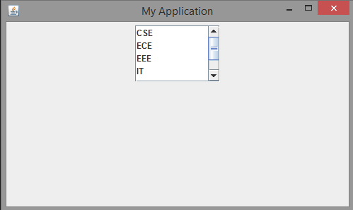
A list box displays a list of items from which the user can select one or more items. A list box can be created using the class JList. Starting from Java 7, JList is defined as a generic class as shown below:
JList<type>
where type represents the data type of the items to be stored in the list. A JList object can be created using the following constructor:
JList(type[] items)
In the above constructor items is an array of the data type type. After creating a JList object, it should be wrapped inside a JScrollPane. It provides scrollbars to navigate the list of items in the JList.
The JList generates ListSelectionEvent when a user selects or deselects an item in the list. It is handled by implementing the ListSelectionListener interface which is available in javax.swing.event package and the event handling method is valueChanged().
We can set the selection mode of a JList by using setSelectionMode() whose general form is as follows:
void setSelectionMode(int mode)
In the above syntax mode can be any one of the following constants:
SINGLE_SELECTION
SINGLE_INTERVAL_SELECTION
MULTIPLE_INTERVAL_SELECTION
Following are some of the methods available in the JList class:
int getSelectedIndex() – Returns the index of the selected item
E getSelectedValue() – Returns the value of the item selected by the user
Following code demonstrates working with JList:
import java.awt.*;
import javax.swing.*;

public class MyFrame extends JFrame
{
	JList<String> jl;
	JScrollPane jsp;
	MyFrame()
	{
		setSize(500, 300);
		setTitle("My Application");
		setLayout(new FlowLayout());
		String[] branches = {"CSE", "ECE", "EEE", "IT", "MECH", "CIV"};
		jl = new JList<String>(branches);
		jsp = new JScrollPane(jl);
		jsp.setPreferredSize(new Dimension(120, 80));
		add(jsp);
		setVisible(true);
		setDefaultCloseOperation(JFrame.EXIT_ON_CLOSE);
	}
	public static void main(String[] args)
	{
		MyFrame mf = new MyFrame();
	}
}
Output of the above code is as shown below:
Combo Boxes
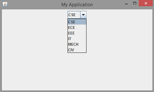
A combo box control displays a pop-up list of items from which user can select only one item. A combo box can be created using the JComboBox class. Starting from Java 7, JComboBox class is defined as a generic class as shown below:
JComboBox<type>
An object of JComboBox class can be created using the following constructors:
JComboBox()
JComboBox(E[] items)
Following are some of the methods available in JComboBox class:
void addItem(E obj) – To add an item is the combo box
Object getSelectedItem() – To retrieve the item selected by the user
int getSelectedIndex() – To retrieve the index of the item selected by the user
A JComboBox object generates action event when the user selects an item from the list. It also generates an item event when the user selects or deselects an item from the list.
Following code demonstrates working with JComboBox:
import java.awt.*;
import javax.swing.*;

public class MyFrame extends JFrame
{
	JComboBox<String> jc;
	MyFrame()
	{
		setSize(500, 300);
		setTitle("My Application");
		setLayout(new FlowLayout());
		String[] branches = {"CSE", "ECE", "EEE", "IT", "MECH", "CIV"};
		jc = new JComboBox<String>(branches);
		add(jc);
		setVisible(true);
		setDefaultCloseOperation(JFrame.EXIT_ON_CLOSE);
	}
	public static void main(String[] args)
	{
		MyFrame mf = new MyFrame();
	}
}
Output of the above code is as shown below:
Tables
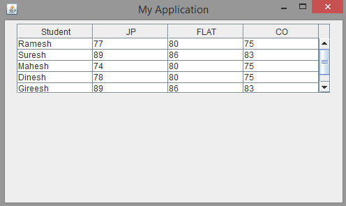
A table control can be used to display data in the form of rows and columns. Each column contains a heading. A table can be created using the JTable class. Several classes and interfaces associated with the JTable class are available in the javax.swing.table package.
A JTable object can be created with the following constructor:
JTable(Object[][] data, Object[] colHeads)
In the above syntax data is a two-dimensional array that contains the original data to be displayed in the table and colHeads is a one-dimensional array that contains the column headings. As JTable does not provide scrolling capability, it should be wrapped in JScrollPane.
A JTable generates ListSelectionEvent when the user selects something in a table. It generates TableModelEvent when the data in the table is somehow changed.
Following code demonstrates working with JTable:
import java.awt.*;
import javax.swing.*;

public class MyFrame extends JFrame
{
	JTable jt;
	JScrollPane jsp;
	MyFrame()
	{
		setSize(500, 300);
		setTitle("My Application");
		setLayout(new FlowLayout());
		String[] colHeads = {"Student", "JP", "FLAT", "CO"};
		String[][] data = {	{"Ramesh", "77", "80", "75"},
							{"Suresh", "89", "86", "83"},
							{"Mahesh", "74", "80", "75"},
							{"Dinesh", "78", "80", "75"},
							{"Gireesh", "89", "86", "83"},
							{"Paramesh", "77", "84", "72"} };
		jt = new JTable(data, colHeads);
		jsp = new JScrollPane(jt);
		jsp.setPreferredSize(new Dimension(450, 100));
		add(jsp);
		setVisible(true);
		setDefaultCloseOperation(JFrame.EXIT_ON_CLOSE);
	}
	public static void main(String[] args)
	{
		MyFrame mf = new MyFrame();
	}
}
Output of the above code is as shown below:
Next let’s look at an introduction to JDBC.

Suryateja Pericherla, at present is a Research Scholar (full-time Ph.D.) in the Dept. of Computer Science & Systems Engineering at Andhra University, Visakhapatnam. Previously worked as an Associate Professor in the Dept. of CSE at Vishnu Institute of Technology, India.
He has 11+ years of teaching experience and is an individual researcher whose research interests are Cloud Computing, Internet of Things, Computer Security, Network Security and Blockchain.
He is a member of professional societies like IEEE, ACM, CSI and ISCA. He published several research papers which are indexed by SCIE, WoS, Scopus, Springer and others.


Leave a Reply