
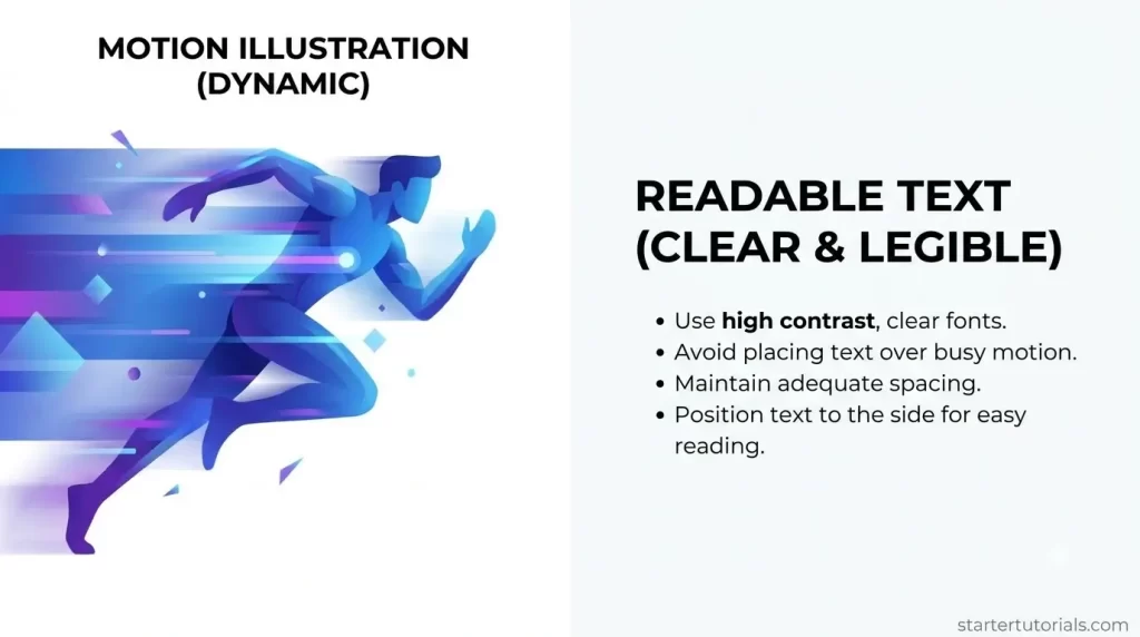
A web page can use a moving illustration to introduce an idea, but visitors should still be able to understand its message from the page itself. Keeping headings, explanations, and links separate from the visual makes the design easier to revise. It also gives a beginner a clear starting point: build a complete text-and-image layout first, then consider movement.
Imagine a practice page for an original paper-folding project. It contains a title, a short explanation, a photograph of the finished paper object, and a link to written steps. This is a fictional design exercise, not a report of a published site. The photograph belongs to the page creator and contains no people or private information.
Write the page before arranging the visual
Begin with the information a visitor needs. Give the project a descriptive heading, explain what the page contains, and write the destination of the next action clearly. For this example, “Read the folding steps” is more informative than “Click here.” Keep the instructions in the page text instead of placing them only inside a photograph or video.
Read the draft without looking at the illustration. Can someone identify the project and decide where to go next? If a paragraph refers to a colour, shape, or position, explain the relevant detail in words. The illustration can support the explanation once the explanation is complete.
Make a simple layout with a still image
Place the heading and introduction together. Put the photograph close to the paragraph it supports, followed by a short caption when context is useful. A two-column arrangement may suit a wide screen, while a narrower layout can place the text above the image. Decide the reading order before adding decorative treatments.
Use the same source photograph when comparing layout options. Crop a working copy, retaining the untouched original. Check that the complete paper object remains recognisable and that important details are not lost at the edges. A close crop should have a clear purpose, such as showing the folded corner discussed in the text.
Keep words outside the image
Add the heading, description, and action link as actual page content. Avoid building a complete introduction as a single picture containing all its words. Separate text can be selected, revised, and presented independently of the visual. It also allows a long heading to wrap naturally instead of shrinking with the image.
Use a short alternative description for an informative image, reflecting its role in the page. In the practice example, a description might identify the folded paper object and the detail being discussed. If an image is purely decorative, handle it as decoration in the chosen publishing system. Check the system’s documentation rather than guessing which field controls that behaviour.
Choose what movement would add
Ask a specific question before producing an animation. Does the page need a timed sequence showing several photographs? Would a restrained pan across the finished object introduce its shape? Or is the still already enough? Writing down the intended purpose avoids choosing motion simply because an editing option is available.
A manually edited slideshow can preserve the order of actual photographs. Recorded footage can show a real folding action if the creator has filmed it. These formats have different meanings: moving between stills presents existing images, while real footage records the action. Keep that distinction clear in any caption or explanation.
Use generated motion as a labelled interpretation
For a creative preview, Magic Hour’s image-to-video tool provides a starting-image workflow with an optional movement description, followed by generation, preview, and download. The resulting clip can be considered alongside the still and the manual sequence. It is a new interpretation of the source, rather than evidence that the paper object moved in the depicted way.
Keep the first concept modest. The practice page might use a gentle camera movement around the existing composition. Label the result “AI-generated motion illustration” wherever it could otherwise be mistaken for recorded footage. Do not use generated folding steps as instructions for making the object. The verified written steps and actual source photographs should remain separate.
Review frames before adding the clip
Compare the start, middle, and end of the generated clip with the source photograph. Check the object’s outline, corners, surface details, and background. Look for invented parts or changing proportions. If the result changes the meaning of the illustration, choose another treatment or return to the still image.
Keep captions and page headings outside the generated frames. Watch the preview without sound and make sure the page still supplies the important information. If spoken explanation is part of the final video, prepare captions and a text transcript. Use an image representing the clip as its initial view, and consider how visitors will start, pause, and stop playback.
Check the complete page at different sizes
Inspect the layout on a wide screen and a narrow screen. Read the heading, paragraph, caption, and action link in order. Look for text placed over a busy area, cropped details, or controls that disappear outside the visible region. Check the still version too, rather than reviewing only the motion treatment.
Save the source image, working copy, motion file, and approved wording with distinct names. Before publication, review the actual exported clip and the final page together. A useful beginner design lets the words carry the explanation while the visual provides context. Motion can then remain an optional creative choice, supported by clear captions and a complete written message.

Leave a Reply