

Bootplus is a front-end framework which is built on top of Twitter Bootstrap. Bootplus is customized to reproduce the look and feel of Google+. Almost everything available in Bootstrap is also present in Bootplus.
Bootplus utilizes LESS CSS, is compiled via Node, and is managed through GitHub.
Note: Using Bootplus requires prior knowledge in HTML, CSS, JavaScript, and jQuery.
To get started with Bootplus, go to official page and click the “Download package” button to get the “bootplus.zip” file on to your system.
Next, extract the zip file which creates “bootstrap” folder which contains a bunch of files arranged as shown below:
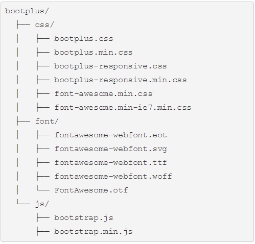
Now you are ready to develop web pages using Bootplus framework. Create a folder “website” on Desktop (for convenience). Copy all three folders css, font and js into your “website” directory.
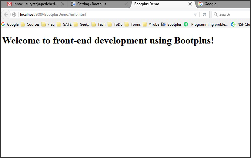
Create a new file “hello.html” and copy paste the following code in to it and save the file:
<!DOCTYPE html>
<html>
	<head>
		<meta charset="ISO-8859-1">
		<title>Bootplus Demo</title>
		<meta name="viewport" content="width=device-width, initial-scale=1.0" />
	</head>
	<body>
		<h1>Welcome to front-end development using Bootplus!</h1>
		<script src="http://code.jquery.com/jquery.js"></script>
	</body>
</html>
Save the file and open the file (hello.html) in a web browser. The output should be something like shown below:
Now we will apply Bootplus to our webpage (hello.html). Replace the code in hello.html with the following code:
<!DOCTYPE html>
<html>
	<head>
		<meta charset="ISO-8859-1">
		<title>Bootplus Demo</title>
		<meta name="viewport" content="width=device-width, initial-scale=1.0" />
	    <!-- Bootplus -->
	    <link href="css/bootplus.min.css" rel="stylesheet" media="screen" />
	    <link href="css/bootplus-responsive.min.css" rel="stylesheet" media="screen" />
	    <!--[if IE 7]>
	    <link rel="stylesheet" href="css/bootplus-ie7.min.css" />
	    <![endif]-->
	</head>
	<body>
		<h1>Welcome to front-end development using Bootplus!</h1>
		<script src="http://code.jquery.com/jquery.js"></script>
		<script src="js/bootstrap.min.js"></script>
	</body>
</html>
We have added code to include the following files:
- bootplus.min.css (for PCs and Laptops)
- bootplus-responsive.min.css (for mobiles, tablets)
- bootstrap.min.js
The output will look something as shown below:
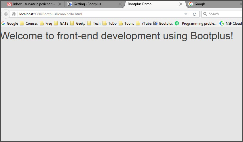
If you are able to see the output as shown above you have succeeded in applying Bootplus to your webpage (hello.html).
That’s it for this tutorial! I will cover much more of Bootplus in future articles.

Suryateja Pericherla, at present is a Research Scholar (full-time Ph.D.) in the Dept. of Computer Science & Systems Engineering at Andhra University, Visakhapatnam. Previously worked as an Associate Professor in the Dept. of CSE at Vishnu Institute of Technology, India.
He has 11+ years of teaching experience and is an individual researcher whose research interests are Cloud Computing, Internet of Things, Computer Security, Network Security and Blockchain.
He is a member of professional societies like IEEE, ACM, CSI and ISCA. He published several research papers which are indexed by SCIE, WoS, Scopus, Springer and others.
Leave a Reply